Edition


-(1)-202408140552.gif)


Boats for sale
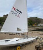
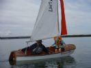
| Laser 140101 Tynemouth |
 |
| Rossiter Pintail Mortagne sur Gironde, near Bordeaux |
 |
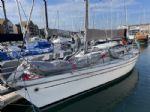
| Laser 28 - Excellent example of this great design Hamble le rice |
 |
List classes of boat for sale |


I like it. |
Post Reply 
|
Page 123> |
| Author |
 Printable Version Printable Version Delicious Delicious Digg Digg Facebook Facebook Furl Furl Google Google MySpace MySpace Newsvine Newsvine reddit reddit StumbleUpon Translate StumbleUpon Translate Twitter Twitter Windows Live Windows Live Yahoo Bookmarks Yahoo Bookmarks Topic Search Topic Search  Topic Options Topic Options
|
Hector 
Really should get out more 

Joined: 10 May 04 Location: Otley, Yorkshire Online Status: Offline Posts: 750 |
 Post Options Post Options
 Quote Reply Quote Reply
 Topic: I like it. Topic: I like it.Posted: 08 Sep 10 at 12:30am |
|
I like the new look of these web pages - looks cleaner somehow.
There also appears to be options to access more pages via the buttons at the bottom.
And I get to use an icon in the title!
I'm sure any doubter(s) will get used to it very quickly.
Maybe needs a 'sticky' with brief guide on how to best use the pages - apologies if thats already done somewhere. Edited by Hector - 08 Sep 10 at 12:31am |
|
|
Keith
29er 661 (with my daughters / nephew) 49er 688 (with Phil P) RS200 968 Vortex (occasionally) Laser 2049XX |
|
 |
|
|
Martin - LSC
Newbie 
Joined: 05 Feb 10 Location: United Kingdom Online Status: Offline Posts: 32 |
Post Options
Quote Reply
Posted: 08 Sep 10 at 2:54am |
|
I like the site too, but what has happened to the Active Sites button. It was a great short cut to only posts that were recently sent. Miss that function. Martin
|
|
|
FINN 57 LSC
|
|
|
|
|
Mark Jardine
Admin Group

Joined: 12 Mar 04 Location: Milford-on-Sea, United King Online Status: Offline Posts: 1028 |
Post Options
Quote Reply
Posted: 08 Sep 10 at 7:37am |
|
Hi Martin
'Active Topics' is now called 'New Posts' and is at the top right. Other than that, there are bound to be a couple of teething troubles and things we need to tweak. Cheers, Mark |
|
|
|
|
Contender 541
Really should get out more

Joined: 05 Dec 05 Location: Burton on Trent Online Status: Offline Posts: 1402 |
Post Options
Quote Reply
Posted: 08 Sep 10 at 7:58am |
|
I especially like the (X new posts) that one can click onto and go to the end of a thread from where one left off
|
|
|
When you find a big kettle of crazy it's probably best not to stir it - Pointy Haired Boss
Crew on 505 8780 |
|
|
|
|
G.R.F.
Really should get out more
Joined: 10 Aug 08 Location: United Kingdom Online Status: Offline Posts: 4028 |
Post Options
Quote Reply
Posted: 08 Sep 10 at 8:44am |
|
Well I like it and there are bound to be a few glitches, but nowhere near as traumatic as the carnage that occurred on the old sister site when it transferred from Boards.co.uk to mbongo, they haven't really recovered.
Can we have polls turned on? I need to do some more stirring. Like the new movie insert icon, Sarah will be pleased. Like the alternative emocions. Long overdue, but worth the wait. Ignore Dan Dumberer he should be working at the sewing machine making spinnaker socks and otherwise preparing the command vessel for hyperspace at the Round Sheppey this weekend, not wasting time on forums. |
|
|
|
|
ifoxwell
Really should get out more
Joined: 05 Jan 06 Location: Hoo Online Status: Offline Posts: 669 |
Post Options
Quote Reply
Posted: 08 Sep 10 at 9:12am |
|
I was about to reply positively to this thread only to find that the system stopped me... apparently there is a minimum time limit between posts!!
Something you might want to check guys Ian
|
|
|
RS300
|
|
|
|
|
winging it
Really should get out more

Joined: 22 Mar 07 Online Status: Offline Posts: 3958 |
Post Options
Quote Reply
Posted: 08 Sep 10 at 9:16am |
|
I think I like it..... There seems to be a lot of white space, maybe some of the headings could be bigger for those of us with middle aged eye sight? I mean the ones directing us to Forum Home etc, up in the top left..
although now I know where they are.... |
|
|
the same, but different...
|
|
|
|
|
winging it
Really should get out more
Joined: 22 Mar 07 Online Status: Offline Posts: 3958 |
Post Options
Quote Reply
Posted: 08 Sep 10 at 9:26am |
|
Wooooo! I have wanted this for ages!  |
|
|
the same, but different...
|
|
|
|
|
Oli
Really should get out more
Joined: 23 Mar 05 Online Status: Offline Posts: 1020 |
Post Options
Quote Reply
Posted: 08 Sep 10 at 9:45am |
|
i like it but could the delineation between the replys be bolder, the blue band is too light and doesnt match the rest of the website colouring. apart from that its a great effort and im loving the fact that vid can be shown on here now. well done
|
|
|
|
|
jeffers
Really should get out more

Joined: 29 Mar 04 Location: United Kingdom Online Status: Offline Posts: 3048 |
Post Options
Quote Reply
Posted: 08 Sep 10 at 10:04am |
|
first impressions look good, i did wonder if this was the reason for the maintenance.....
|
|
|
Paul
---------------------- D-Zero GBR 74 |
|
|
|
|
Post Reply
|
Page 123> |
| Forum Jump | Forum Permissions You cannot post new topics in this forum You cannot reply to topics in this forum You cannot delete your posts in this forum You cannot edit your posts in this forum You cannot create polls in this forum You cannot vote in polls in this forum |
Bulletin Board Software by Web Wiz Forums® version 9.665y
Copyright ©2001-2010 Web Wiz
Change your personal settings, or read our privacy policy
Copyright ©2001-2010 Web Wiz
Change your personal settings, or read our privacy policy