Edition


-(1)-202408140552.gif)


Boats for sale
| Rossiter Pintail Mortagne sur Gironde, near Bordeaux |
 |
| Laser 140101 Tynemouth |
 |
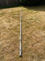
| Free mast for Merlin Rocket - has a bend! Guildford |
 |
List classes of boat for sale |


New look for forum |
Post Reply 
|
Page <1234> |
| Author |
 Printable Version Printable Version Delicious Delicious Digg Digg Facebook Facebook Furl Furl Google Google MySpace MySpace Newsvine Newsvine reddit reddit StumbleUpon Translate StumbleUpon Translate Twitter Twitter Windows Live Windows Live Yahoo Bookmarks Yahoo Bookmarks Topic Search Topic Search  Topic Options Topic Options
|
423zero 
Really should get out more 
Joined: 08 Jan 15 Location: United Kingdom Online Status: Offline Posts: 3420 |
 Post Options Post Options
 Quote Reply Quote Reply
 Topic: New look for forum Topic: New look for forumPosted: 24 Jul 16 at 10:09am |
|
The only issue I have found is size, I have had to reduce to 75%.
The new post shortcut works.
|
|
 |
|
|
Time Lord
Far too distracted from work 
Joined: 03 Dec 13 Location: Warwickshire Online Status: Offline Posts: 301 |
Post Options
Quote Reply
Posted: 24 Jul 16 at 12:27pm |
|
On my android tablet running 6.0.1 on the home page, the main picture has the following underneath.
1(in blue) 1.(black) 2 2 (in blue) 3 3 (in blue) Continues to 5 Weird but bring back the new posts listing and button |
|
|
Merlin Rocket 3609
|
|
|
|
|
Rupert
Really should get out more
Joined: 11 Aug 04 Location: Whitefriars sc Online Status: Offline Posts: 8956 |
Post Options
Quote Reply
Posted: 24 Jul 16 at 12:34pm |
|
I have the new posts button. Never really used it before, but will have to with the new layout, as it seems designed to confuse the eyes.
|
|
|
Firefly 2324, Puffin 229, Minisail 3446 Mirror 70686
|
|
|
|
|
Time Lord
Far too distracted from work
Joined: 03 Dec 13 Location: Warwickshire Online Status: Offline Posts: 301 |
Post Options
Quote Reply
Posted: 25 Jul 16 at 9:32am |
|
Unlike the old recent posts button which showed all the recent posts whether or not you had read them, the new posts button only shows the posts made since you last accessed the button. If you want to mull things over before posting a reply, you have to find the actual topic it was posted under on the forum among the multitude. The old recent posts page brought up all the topics which had had a post in the last x days and made it easier to find a particular thread.
Also I seem to recall that the old recent posts button took you to the last post made on that thread. The new posts takes you to the beginning of a thread and not the new post. Makes for tedious flipping through pages of posts on some threads. |
|
|
Merlin Rocket 3609
|
|
|
|
|
Phil_1193
Groupie 
Joined: 07 Jan 10 Online Status: Offline Posts: 78 |
Post Options
Quote Reply
Posted: 25 Jul 16 at 1:11pm |
Its still there,click on new posts, theres a drop down menu to show posts since last visit, a number of hours, days, weeks etc, top left above the list Hopefully image below works  Edited by Phil_1193 - 25 Jul 16 at 1:14pm |
|
|
|
|
Time Lord
Far too distracted from work
Joined: 03 Dec 13 Location: Warwickshire Online Status: Offline Posts: 301 |
Post Options
Quote Reply
Posted: 25 Jul 16 at 3:24pm |
|
Agreed you can get it that way. Just thought that it would be easier if we still had the recent posts button which automatically showed these up.
|
|
|
Merlin Rocket 3609
|
|
|
|
|
MerlinMags
Admin Group
Joined: 19 Mar 04 Location: UK, Guildford Online Status: Offline Posts: 589 |
Post Options
Quote Reply
Posted: 26 Jul 16 at 10:27am |
|
I have been listening to your thoughts, everyone. I will be having a chat with Mark and looking at what changes we need to make, though I have got a week's holiday first, so please bear with me.
My apologies if you feel things are more difficult; we certainly did not want to make life harder with the new look. |
|
|
|
|
dogslife
Groupie
Joined: 17 Feb 12 Online Status: Offline Posts: 58 |
Post Options
Quote Reply
Posted: 26 Jul 16 at 10:00pm |
|
Sorry, but the new site is a serious step backwards IMHO.
Without question it's harder to navigate, the layout is far too busy & confusing and you can't just look at dinghy (or keel boat) articles in the way you could before. Plus in places it reads like it's been edited/created by someone who can't read, write or speak english or is simply dyslexic. Other than that it's great...........NOT!!! Please sort it out a.s.a.p. |
|
|
|
|
JimC
Really should get out more

Joined: 17 May 04 Location: United Kingdom Online Status: Offline Posts: 6662 |
Post Options
Quote Reply
Posted: 26 Jul 16 at 10:58pm |
|
I dunno, it doesn't seem *that* different to me. If you can't remember quite what the old one looked like go to http://web.archive.org/web/20160308170030/http://www.yachtsandyachting.com/
Most of what I did I do in the same way now. I don't think I'd go so far as to say I prefer the new look though. Its very interesting to me the difference between having two narrow columns of advertisements, one each side and one wide one. It certainly makes the animation of the ads more in your face, and of course they are paying the bills and we aren't. Worth looking at the Sail-World site. If you figure that's the house style the boys have to conform to then they don't have too many choices. In their place I might be tempted to looking at putting a bare left margin on the forum pages once they get to a reasonable width, which I think would make it a bit more readable on larger devices. Edited by JimC - 26 Jul 16 at 11:00pm |
|
|
|
|
MerlinMags
Admin Group
Joined: 19 Mar 04 Location: UK, Guildford Online Status: Offline Posts: 589 |
Post Options
Quote Reply
Posted: 27 Jul 16 at 10:26am |
|
The previous version of the website continues to operate at old.yachtsandyachting.com if you wish to use that version.
Just to clarify: YachtsandYachting.com owns Sail-World.com (not the other way around). |
|
|
|
|
Post Reply
|
Page <1234> |
| Forum Jump | Forum Permissions You cannot post new topics in this forum You cannot reply to topics in this forum You cannot delete your posts in this forum You cannot edit your posts in this forum You cannot create polls in this forum You cannot vote in polls in this forum |
Bulletin Board Software by Web Wiz Forums® version 9.665y
Copyright ©2001-2010 Web Wiz
Change your personal settings, or read our privacy policy
Copyright ©2001-2010 Web Wiz
Change your personal settings, or read our privacy policy