Edition


Boats for sale
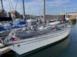
| Rossiter Pintail Mortagne sur Gironde, near Bordeaux |
 |
| Laser 28 - Excellent example of this great design Hamble le rice |
 |
List classes of boat for sale |


Contrasting Sail Numbers... |
Post Reply 
|
Page 123 4> |
| Author |
 Printable Version Printable Version Delicious Delicious Digg Digg Facebook Facebook Furl Furl Google Google MySpace MySpace Newsvine Newsvine reddit reddit StumbleUpon Translate StumbleUpon Translate Twitter Twitter Windows Live Windows Live Yahoo Bookmarks Yahoo Bookmarks Topic Search Topic Search  Topic Options Topic Options
|
gordon 
Really should get out more 
Joined: 07 Sep 04 Online Status: Offline Posts: 1037 |
 Post Options Post Options
 Quote Reply Quote Reply
 Topic: Contrasting Sail Numbers... Topic: Contrasting Sail Numbers...Posted: 23 Jul 12 at 5:56pm |
|
1406 may well get a few DNFs !
|
|
|
Gordon
|
|
 |
|
|
zippyRN
Far too distracted from work 
Joined: 14 Sep 06 Online Status: Offline Posts: 437 |
Post Options
Quote Reply
Posted: 23 Jul 12 at 12:54am |
1298s are clearly contrasting with the white / clear sail, less convinced about 1406s
|
|
|
|
|
Ruscoe
Really should get out more

Joined: 12 Jan 10 Online Status: Offline Posts: 1514 |
Post Options
Quote Reply
Posted: 20 Jul 12 at 3:04pm |
|
Which is pretty much what i said!!
|
|
|
|
|
|
|
|
Strawberry
Really should get out more

Joined: 21 Jun 05 Location: United Kingdom Online Status: Offline Posts: 1337 |
Post Options
Quote Reply
Posted: 20 Jul 12 at 2:46pm |
|
At the end of the day your opinion doesn't matter, my opinion doesn't matter, no other poster's opinions matter. The opinion that does matter is that of the protest committee. If people are happy to take that risk of having different coloured sail numbers they'll have their chance in front of the committee.
|
|
|
Cherub 2649 "Dangerous Strawberry
|
|
|
|
|
Ruscoe
Really should get out more
Joined: 12 Jan 10 Online Status: Offline Posts: 1514 |
Post Options
Quote Reply
Posted: 20 Jul 12 at 1:48pm |
|
FWIW i am all for it if you are stupid enough to have a number thats illegible than its fair play. However the floursent numbers my pals have on black sails stand out and are pretty easy to read IMO. |
|
|
|
|
|
|
|
Guests
Guest Group 
|
Post Options
Quote Reply
Posted: 20 Jul 12 at 12:57pm |
|
You can have numbers that look different, but the PRO has got to be able to read them.
At Salcombe Week, I believe there was some difficulty reading the numbers of some boats at the busy starts. If the PRO can't read your number at the start, he may not be able to read it at the finish. Seems a shame to get a DNF just for the sake of trendiness, so possibly better to stick to something that has been demonstrated to be readable. |
|
|
|
|
Ruscoe
Really should get out more
Joined: 12 Jan 10 Online Status: Offline Posts: 1514 |
Post Options
Quote Reply
Posted: 20 Jul 12 at 12:50pm |
|
That doesn't make any sense Jim?
|
|
|
|
|
|
|
|
JimC
Really should get out more

Joined: 17 May 04 Location: United Kingdom Online Status: Offline Posts: 6662 |
Post Options
Quote Reply
Posted: 20 Jul 12 at 12:29pm |
If we are being pedantic then we should note that as long as your sails are just as legible as all the others then you can't be DSQ just because they are different in colour or font or something like that (class rules permitting). Edited by JimC - 20 Jul 12 at 2:04pm |
|
|
|
|
olly_love
Really should get out more
Joined: 18 Jan 05 Location: United Kingdom Online Status: Offline Posts: 1145 |
Post Options
Quote Reply
Posted: 20 Jul 12 at 10:53am |
|
from that view they are nice and easy to read but this view
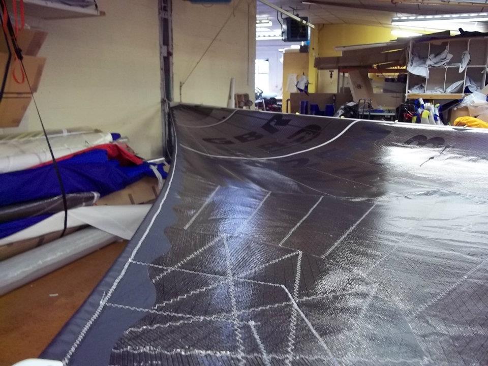 Edited by olly_love - 20 Jul 12 at 10:53am |
|
|
TWO FRANK-Hunter Impala
|
|
|
|
|
Ruscoe
Really should get out more
Joined: 12 Jan 10 Online Status: Offline Posts: 1514 |
Post Options
Quote Reply
Posted: 20 Jul 12 at 10:48am |
|
I would argue that in the sunlight the flourcent numbers are as easy to read as black numbers on the ODL series of black sail cloth. As i understand it no one has complained about my pals sail numbers as yet, the sails were measured with numbers in place. If you did get protested out for having something that is legable but different in my mind you have a moral victory over the pedantic morons anyway.
|
|
|
|
|
|
|

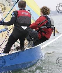
 My bro and pal in their Phantoms what do you think of these numbers!
|
Post Reply
|
Page 123 4> |
| Forum Jump | Forum Permissions You cannot post new topics in this forum You cannot reply to topics in this forum You cannot delete your posts in this forum You cannot edit your posts in this forum You cannot create polls in this forum You cannot vote in polls in this forum |
Bulletin Board Software by Web Wiz Forums® version 9.665y
Copyright ©2001-2010 Web Wiz
Change your personal settings, or read our privacy policy
Copyright ©2001-2010 Web Wiz
Change your personal settings, or read our privacy policy