Edition


-(1)-202408140552.gif)


Boats for sale
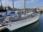
| Rossiter Pintail Mortagne sur Gironde, near Bordeaux |
 |
| Laser 28 - Excellent example of this great design Hamble le rice |
 |
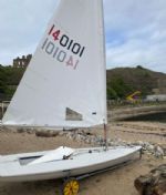
| Laser 140101 Tynemouth |
 |
List classes of boat for sale |


V Twin |
Post Reply 
|
Page <1 5253545556 142> |
| Author |
 Printable Version Printable Version Delicious Delicious Digg Digg Facebook Facebook Furl Furl Google Google MySpace MySpace Newsvine Newsvine reddit reddit StumbleUpon Translate StumbleUpon Translate Twitter Twitter Windows Live Windows Live Yahoo Bookmarks Yahoo Bookmarks Topic Search Topic Search  Topic Options Topic Options
|
Xpletive 
Far too distracted from work 
Joined: 28 Jan 06 Online Status: Offline Posts: 320 |
 Post Options Post Options
 Quote Reply Quote Reply
 Topic: V Twin Topic: V TwinPosted: 05 Sep 11 at 5:11pm |
|
Looks like a cross-section through a toilet pan containing an unsavoury deposit.
|
|
 |
|
|
bferry
Posting king 

Joined: 01 Jun 09 Location: Malta Online Status: Offline Posts: 190 |
Post Options
Quote Reply
Posted: 05 Sep 11 at 5:21pm |
|
Good concept for logo, however I'd suggest simplifying it by removing the T, I, N and possibly the W. Maybe adding a red 'T'. That way the emphasis is on the V and the T. Most logos do not have the full name on, they just give a reference. |
|
|
Bernard
Vareo 249 Miracle 2818 Malta |
|
|
|
|
JimC
Really should get out more 

Joined: 17 May 04 Location: United Kingdom Online Status: Offline Posts: 6662 |
Post Options
Quote Reply
Posted: 05 Sep 11 at 5:30pm |
|
What sort of logo: sail logo, web site, publicty, what... There is something to be said for keeping sail logos simple as highlighted above.
|
|
|
|
|
ob1
Groupie 
Joined: 21 Feb 11 Online Status: Offline Posts: 72 |
Post Options
Quote Reply
Posted: 05 Sep 11 at 5:36pm |
|
the logo (not the boat) looks like one of those psycology tests with the folded inkblots that always turn out lookinhg liak a xxxx
the boat looks great Edited by ob1 - 05 Sep 11 at 5:53pm |
|
|
|
|
rodney
Really should get out more
Joined: 26 Feb 09 Location: United Kingdom Online Status: Offline Posts: 915 |
Post Options
Quote Reply
Posted: 05 Sep 11 at 5:37pm |
|
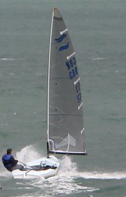
Having seen it in real life (so to speak) my only concerns are whether it will work on light airs? (I doubt it), will it tack on a sixpence? (will it tack at all?), how quick in strong winds (will anyone be able to handle it?). It is, for sure, innovative but looks like a small thames barge (well not that small) - this may yet be the future of dinghy sailing as we know it???
Good luck with the project Graeme - I would love to have a go once some of the smaller issues are sorted Rodney
|
|
|
Rodney Cobb
Suntouched Sailboats Limited http://www.suntouched.co.uk [EMAIL=rodney@suntouched.co.uk">rodney@suntouched.co.uk |
|
|
|
|
Jack Sparrow
Really should get out more

Joined: 08 Feb 05 Location: United Kingdom Online Status: Offline Posts: 2965 |
Post Options
Quote Reply
Posted: 05 Sep 11 at 6:10pm |
|
|
|
maxibuddah
Really should get out more

Joined: 06 Mar 09 Location: United Kingdom Online Status: Offline Posts: 1760 |
Post Options
Quote Reply
Posted: 05 Sep 11 at 9:55pm |
|
The V-Twin starting to look a little like this - not the logo obviously

|
|
|
Everything I say is my opinion, honest
|
|
|
|
|
maxibuddah
Really should get out more
Joined: 06 Mar 09 Location: United Kingdom Online Status: Offline Posts: 1760 |
Post Options
Quote Reply
Posted: 05 Sep 11 at 10:03pm |
|
Or was it this?

|
|
|
Everything I say is my opinion, honest
|
|
|
|
|
dics
Far too distracted from work
Joined: 05 Oct 05 Online Status: Offline Posts: 317 |
Post Options
Quote Reply
Posted: 06 Sep 11 at 9:11am |
Edited by dics - 06 Sep 11 at 9:12am |
|
|
|
|
Barty
Far too distracted from work

Joined: 16 Mar 04 Location: Scotland Online Status: Offline Posts: 240 |
Post Options
Quote Reply
Posted: 06 Sep 11 at 12:31pm |
|
I would have thought something like this would be simpler
 |
|
|
|

|
Post Reply
|
Page <1 5253545556 142> |
| Forum Jump | Forum Permissions You cannot post new topics in this forum You cannot reply to topics in this forum You cannot delete your posts in this forum You cannot edit your posts in this forum You cannot create polls in this forum You cannot vote in polls in this forum |
Bulletin Board Software by Web Wiz Forums® version 9.665y
Copyright ©2001-2010 Web Wiz
Change your personal settings, or read our privacy policy
Copyright ©2001-2010 Web Wiz
Change your personal settings, or read our privacy policy